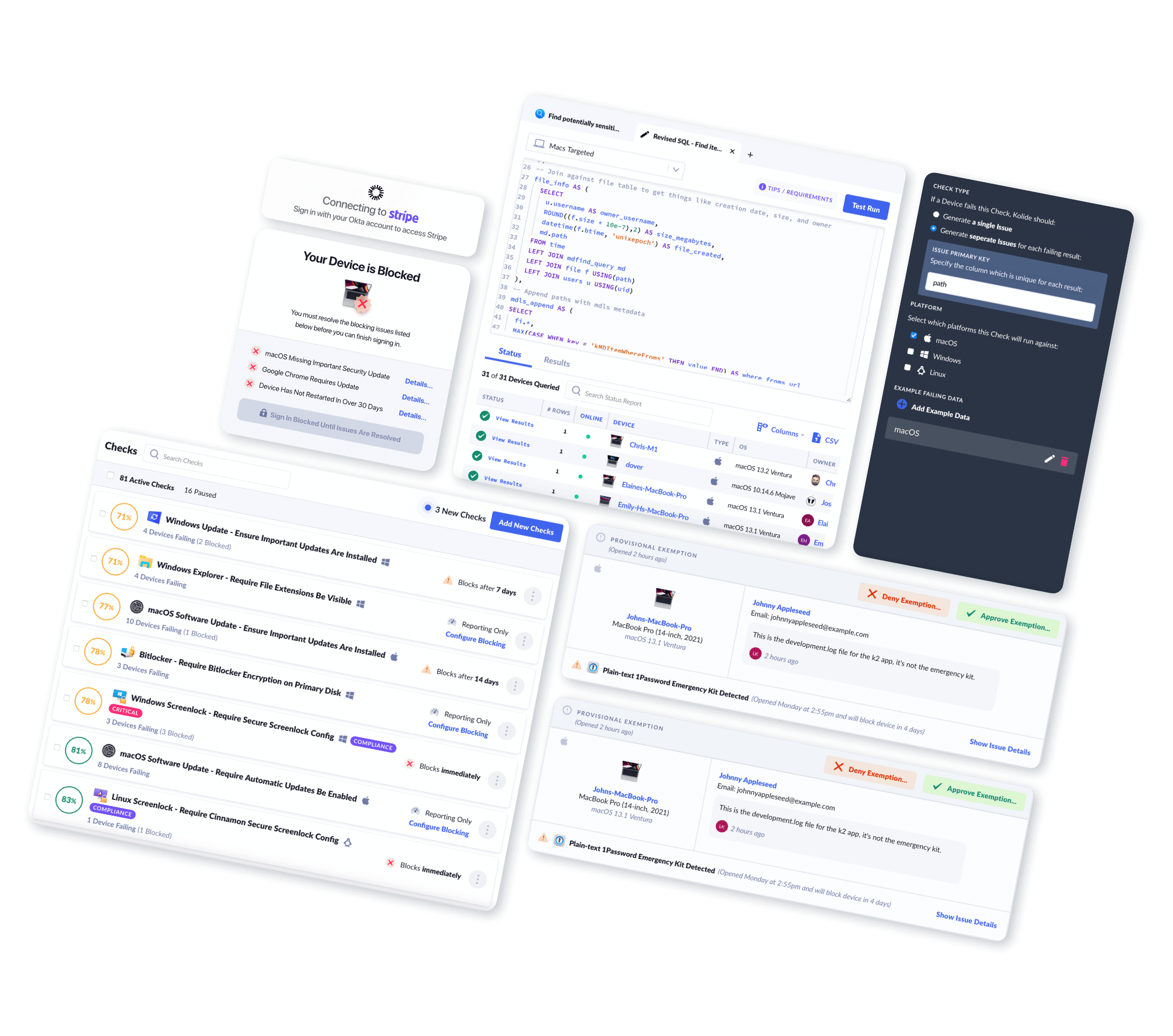
Big Changes to Our Mobile App
Note: Kolide Mobile is only available for organizations using our Device Trust for Okta solution
We’re excited to reveal a major Kolide Mobile update. This update introduces management of your Kolide device registrations, a UI refresh, and under-the-hood changes to prepare for new features coming soon!
Manage Kolide device registration
After your device is registered, the initial screen of the app is now a list of your devices registered with Kolide.
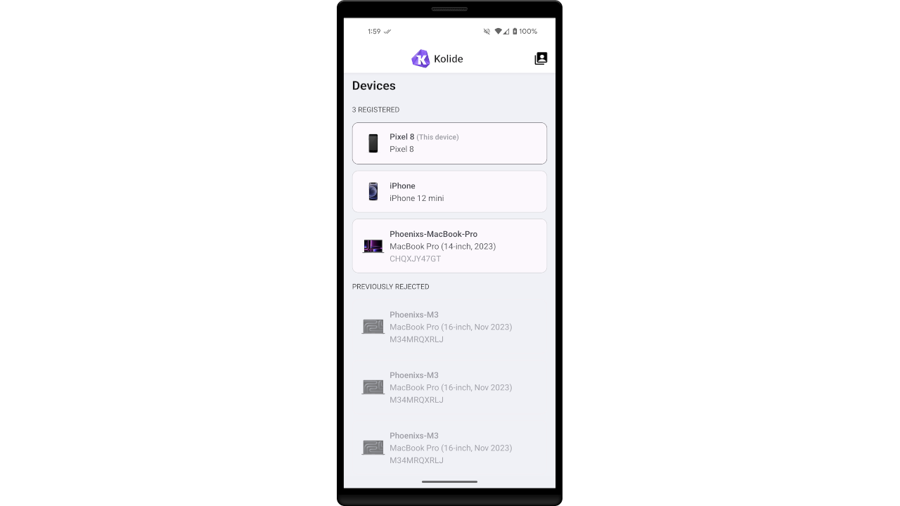
Approve or deny device registration requests
If you have a pending registration request for another device, you can approve it right from the list.
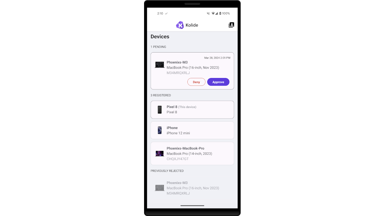
Unregister other devices
By tapping on a device in the list, you can see some basic information and unregister the device from Kolide. You may not unregister your current device with this method; on the dialog for the current device, that button will be absent.
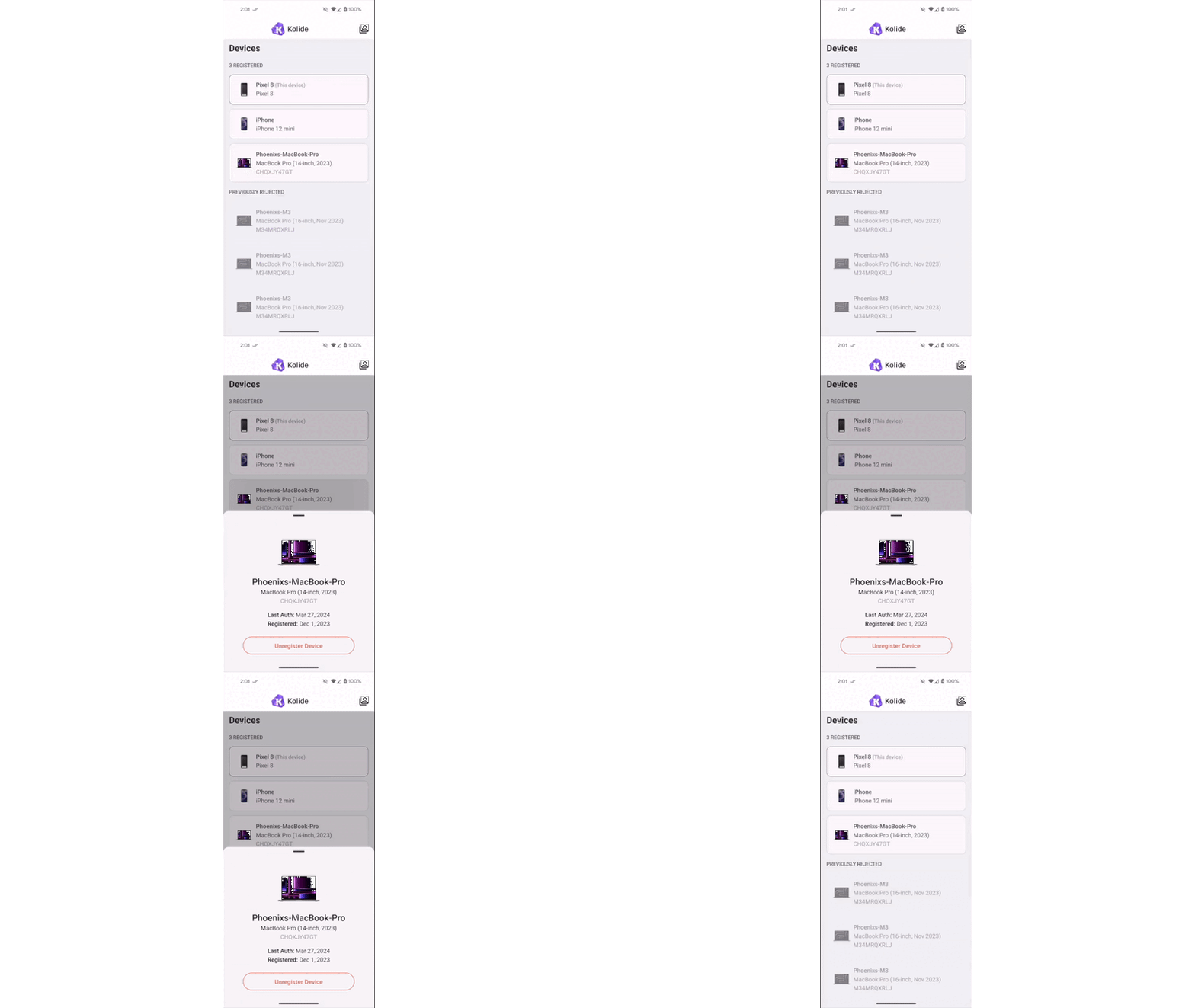
Where’s my registration list?
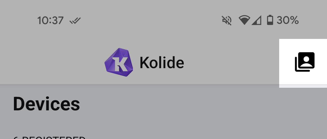
The previous initial screen was the list of registered organizations. This screen is now accessed by tapping the icon in the app bar, in the upper right of the screen.
UI Refresh
The app now has a top app bar, which displays the name and icon of your active organization registration. The majority of Kolide users are only registered to a single organization, so for those users this bar will never change.
We’ve standardized components and colors across the app, including the introduction of Dark Mode!
Dark mode
Dark mode currently syncs to the device appearance setting. This means you will only see a dark UI if your device is set to always be in Dark mode or has a scheduled time to change to Dark mode.
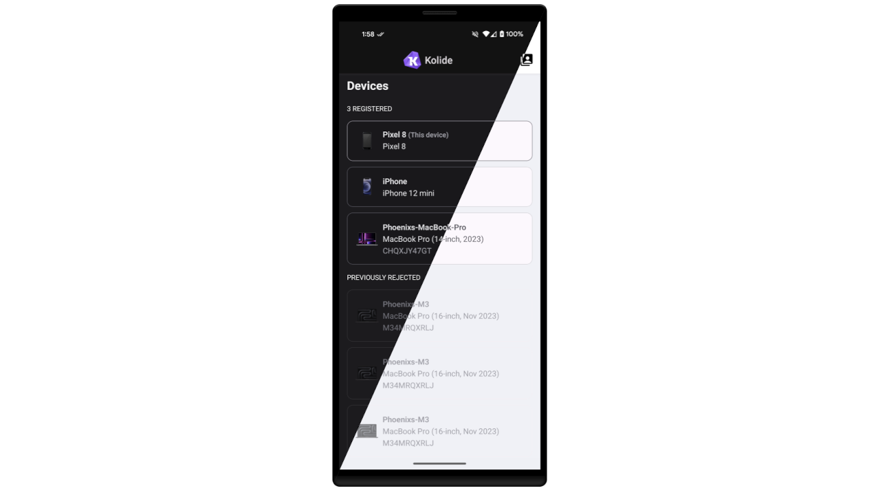
On Android, the setting for Dark theme can be found under Settings app > Display. On iOS, the setting for Dark appearance can be found under Settings app > Display & Brightness.
What’s next in Kolide Mobile?
This release isn’t just the changes you can see; we also made architectural improvements to prepare for the next big feature in Kolide Mobile: Mobile Checks!
We know many of you have been waiting for this, so we’re happy to share that this is the focus of our mobile team for the next few months.


